


In Aqua Map, you can check the forecasts for over 6000 Tide and Tidal Current stations in North America and Oceania. Besides the usual graph, you can also view the tides and currents directly on the map.
To turn on or off the Tides & Currents overlay on the map, simply go to the main Settings menu.
Icons on map
If you have activated the feature, Tides & Currents icons will appear on the map:
 for a realtime Tide prediction.
 for a realtime Tidal current prediction.
Tide icons
Each tide icon shows a number (e.g., 0.3), indicating the tide value (in feet or meters). You'll also see a simplified representation of the Tide graph, indicating the tide phase:
 If the graph is on the right side of the icon, it's a rising tide.
 If the graph is on the left side of the icon, it's a falling tide.
The dark blue and light blue sections of the graph show the percentage of the total tide. A fully dark blue graph indicates High tide, while a fully light blue graph indicates Low tide.
NOTE: Sometimes, the number appears in red, indicating a negative tide (below the Mean Low Sea Level).
Tidal current icons
Each tidal current icon![]() shows:
shows:
- a number (like 1.9), which tells you how fast the current is moving (in knots or kilometers per hour).
- an arrow pointing in the direction of the current's flow.
- A small cyan symbol inside the arrow. If it points in the same direction as the arrow
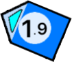 , the current is getting stronger. If it points the other way, the current is weakening
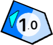 .
. - The arrow has dark blue and light blue sections. They show how much of the total current strength is happening right now. A fully dark blue arrow means the current is at its strongest, while a fully light blue one means it's at its weakest.
These icons might look a bit see-through on the map.![]() That's because they show where the current is below the surface. The more see-through they are, the deeper the current prediction.
That's because they show where the current is below the surface. The more see-through they are, the deeper the current prediction.
Time simulation
When you click on a tide or tidal current icon, a pop-up window will appear like this:

Clicking on the left icon![]() you will start a simulation for all the tides and currents icons on the screen.
you will start a simulation for all the tides and currents icons on the screen.
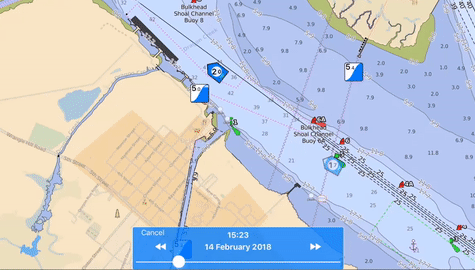
You can adjust the simulation along the selected day by moving the slider.
To move to the previous or next day, tap the arrows in the blue box. Alternatively, tap the date/time label to select a specific date or time.
Detail page
From the pop-up window of a tide or current icon, you can tap the 'info'button to open the info page.

This page is divided into 5 sections, arranged from top to bottom:
- Station Name: Displays the name of the station.
- Date Selection: Allows you to navigate backward (-24 hours) or forward (+24 hours) using the arrows. You can also select a specific date by tapping on the date label. Note: Pay attention to the "Your Time" and "Station Time" switch, which lets you choose the time zone for predictions.
- Graph: Shows the overall tide or current behavior. You can slide the slider to view values at specific times. The green vertical line indicates the current time.
- Main Station Events: Lists the main events with their time, value, and description.
- Bottom Menu: Allows you to switch between a graphical or textual representation of the prediction.

